THE Olympic Games are finally set to get underway today after a one-year delay due to the coronavirus pandemic.
And as with all Games, Tokyo will have its own unique logo.
What is the Tokyo 2020 logo and what does it represent?
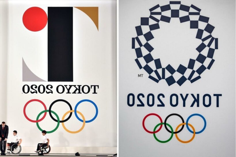
The Tokyo 2020 logo is called the Harmonized Chequered Emblem.
Organisers claim it combines traditional Japanese colours with the Olympics' Unity in Diversity motto.
A statement from Tokyo 2020 said: "Chequered patterns have been popular in countries around the world throughout history.
"In Japan, the chequered pattern was known as “ichimatsu moyo” in the Edo period (1603-1867), and this chequered design in the traditional Japanese colour of indigo blue expresses a refined elegance and sophistication that exemplifies Japan.
"Composed of three varieties of rectangular shapes, the design represents different countries, cultures and ways of thinking.
"It incorporates the message of 'Unity in Diversity'.
"It also expresses the fact that the Olympic and Paralympic Games seek to promote diversity as a platform to connect the world."
Who designed the 2020 Olympic logo?
The revised logos for the Tokyo 2020 Olympic and Paralympic Games have been designed by Asao Tokolo.
Tokolo's designs were chosen in 2016, after the original design was scrapped, after allegations that it was plagiarised.
The first Tokyo 2020 Olympics logo, designed by Kenjiro Sano, was accused of being plagiarized from work by Belgian designer Olivier Debie.
Was the Tokyo 2020 logo changed?
Yes. The original logo was scrapped in 2015 following accusations of plagiarism.
Japanese media reported that designer Kenjiro Sano admitted copying material online.
Toshio Muto, director general of the Tokyo organising committee, told a news conference: "We're certain the two logos are different.
"But we became aware of new things this weekend and there was a sense of crisis that we thought could not be ignored.
🥇 TOKYO OLYMPICS LIVE: All the latest from the Games with our live blog
🥇 WHAT'S ON TODAY? Best bits to watch at the Olympics and UK times for your favourite stars
"We have reached a conclusion that it would be only appropriate for us to drop the logo and develop a new emblem.
"At this point, we have decided that the logo cannot gain public support."
Belgian designer Olivier Debie claimed the logo was taken from his 2013 design for the Theatre de Liege emblem.
Source: Read Full Article


