The news last week that 12 people, some young children, were trapped in a lift during a visit to the Melbourne Aquarium was the stuff of nightmares. One child vomited as a result of the stress and rising temperatures in the confined space.
Luckily the group were rescued, but this unfortunate experience highlights the design flaws and overall poor quality of the aquarium building.
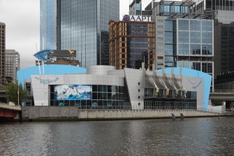
Melbourne’s SEA LIFE Aquarium on the Yarra River.Credit:Ken Irwin
Our city is blessed with many great public buildings, but unfortunately the Sea Life Aquarium is not one of these treasures. The fish are fabulous, the crocodile tremendous, and the penguins sensational, but the building itself does not live up to even moderate expectation. The visitor experience is clunky and unpleasant, which reflects poorly on our city.
Throughout Asia and the US there are many great aquariums that are “must-visit” destinations. Singapore’s S.E.A. Aquarium and Okinawa Churaumi Aquarium in Japan drive significant tourism and contribute to the public wonderment of sea life.
In Melbourne, there is no doubt that our aquarium is popular. You will often find queues out the door and onto the footpath, which is the first sign that the building is not designed well enough to accommodate crowds.
As you make your way through the line, it becomes apparent there is more than one type of shark at this aquarium. The operators in their capitalistic wisdom have decided that everyone must have a group photograph upon entry, regardless of how this further slows the entry process of the frustrated crowd. This way the photos can be sold at inflated prices on the way out.
Once you get inside, one of the biggest problems is the layout. Simply moving around from exhibit to exhibit is tedious and unnecessarily difficult. In parts there is not enough building around the fish, leading to tight squeezes and long waits. In other parts there is far too much building with almost nothing to view at all. It is as if the buildings and exhibits were each designed in isolation.
It is important to stress the key clientele of these venues is young families. Almost everyone visits in groups, and many groups have prams with babies and young children. This makes the use of small and slow passenger lifts as a fundamental part of the visitor journey a significant flaw in this building. As the rest of your group heads down the escalator, those with prams or other access needs are left waiting for the terribly slow and low-capacity lift to arrive.
We could look to Melbourne Zoo as a great example of how the aquarium should have been designed. The zoo’s enclosure for seals and penguins takes visitors deep below the waterline without using lifts and escalators, delivering a smoother and more enjoyable visit.
As visitors move further through the aquarium, the more problems become apparent. Navigating the space is problematic and some patrons end up backtracking against the procession of the crowd. Moving downward into the basement, exposed concrete walls give all the charm of a supermarket carpark. It seems there was no opportunity overlooked for saving money from the construction.
A penguin with a chick at Sea Life Melbourne Aquarium.
So what should we be able to expect from the aquarium? The obvious comparison of a highly successful exhibition-type building is the Melbourne Museum. Based in Carlton Gardens, the museum’s design provides a generous internal space for visitors to explore at their own pace. This layout feels grand and generous whilst also putting visitors in control, enabling them to choose their own path of discovery.
By providing this ample circulation space, the experience is pleasant even during the peak demand of school holidays. Importantly, just like Melbourne Zoo, all levels are accessible to all, without lifts, to ensure groups can explore exhibits together.
Coincidently both the Aquarium and Melbourne Museum are the same age, yet the Museum looks almost as fresh as the day it opened. The Aquarium, on the other hand, feels like a poorly repurposed bunker.
It is hard not to draw the conclusion that the poor-quality visitor experience is the result of the organisation being a for-profit business. Where not-for-profit or government institutions have a quality and community-led focus, a for-profit business is all about shareholder return. It needs to be “just good enough” to not put people off.
It is easy to stand back and say “who cares, they are a private business”. Whilst this is true, our community should be able to expect a minimum quality standard from our publicly accessible buildings. In my view the aquarium does not meet that standard.
As Melbourne reopens for tourism after the COVID shutdown years, a major overhaul of the aquarium will give visitors another reason to explore our beautiful city.
Most Viewed in National
From our partners
Source: Read Full Article


